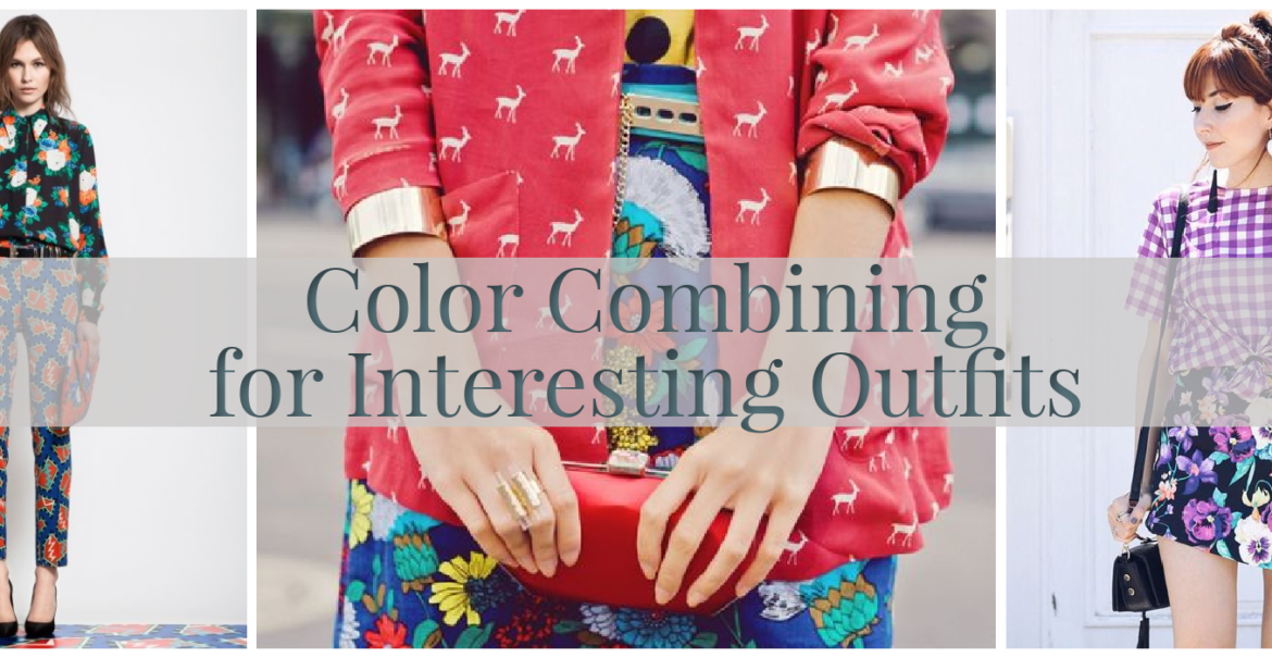
Color Combining for Interesting Outfits
There are many characteristics (qualities? is that the better word?) of clothing that contribute to creating a pleasing or interesting outfit: shape, texture, pattern, fabric, etc. But probably the most noticeable is color.
And probably a lot of people stop at color when putting together an outfit (“this red sweater goes with this navy skirt, DONE”) with no further consideration of the other characteristics mentioned above. And that’s fine. You do you. But you can elevate an outfit so much more by taking those other elements into consideration…BUT I’m not getting into that today. Today is all about color.
Color combining can be broken down into multiple posts, as I don’t want this to get too long. And I’m sort of starting in the middle here because what I really wanted to address today was prompted by a comment when I wore this combination last week:
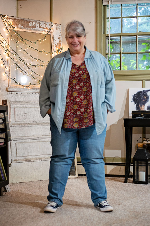
The comment was like (and I’ve paraphrased a bit): {It doesn’t seem like the maroon print top + light blue/chambray button-up shirt should work, but it does!}
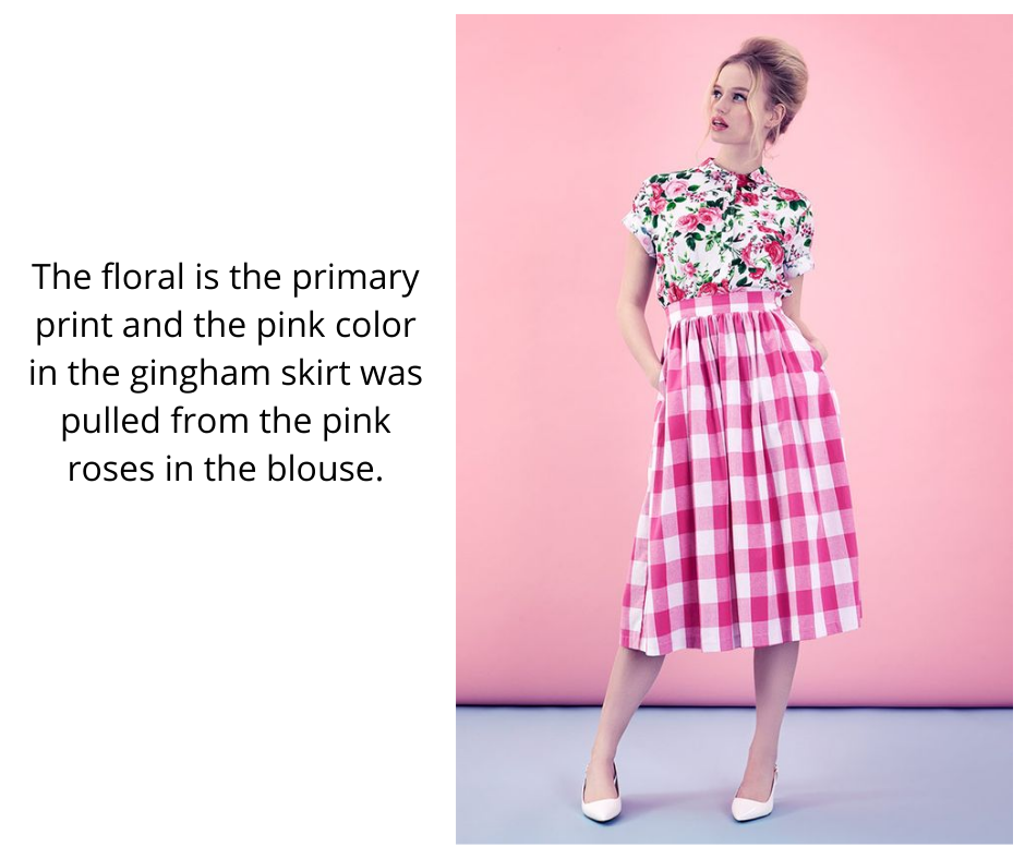
The easiest way to combine a print with a solid color, is to choose a color that’s already in the print. Some designer somewhere has already done the work for you and selected a pleasing combination of colors for the print, so feel free to use that. I use this method a lot.
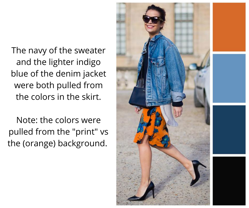
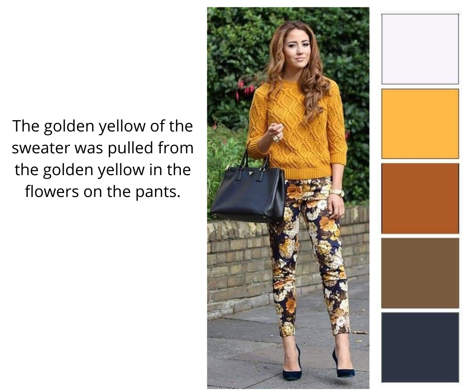
That is a pretty foolproof method, because as I said, a professional has already done the work for you of combining colors.
I will make one caveat here. As I mentioned in the first graphic above, the solid colors were pulled from the print not the background. So I would probably (#nohardandfastrulesinfashion) not pull out the background color and try to match that.
Several reasons for this:
- Trying to match the largest block of color (the background) in the print, is the most challenging. If you’re matching the color of a small leaf in a floral print, if it’s not exactly the same, it won’t be as glaringly obvious. If you tried to match that burnt orange of the skirt and it was not EXACTLY the same, it’s going to look off – and over a large area, if that makes sense.
- I think it’s more fun to match a color that is in smaller amounts in the print. It makes it more of a “pop-py” accent rather than just a continuation of what is already the largest amount of color.
- My one pretty standard exception to this rule (#theyrereallymorelikeguidelines) is if the background is black. Matching blacks is not foolproof but it’s generally easier than matching a “color.” Plus, black. It just sort of works in almost every situation.
These pictures were examples of Color Combining: Print + Solid.
Next up is Color Combining: Print + Print. The same general rules apply – pulling a color from the main print, to be in the secondary print.

Some tips:
- When starting out, mixing a geometric (stripe, check, plaid) with a floral is a pretty easy formula.
- Pay attention to the scale of the two prints. This can get tricky: sometimes keeping the scales the same is best…but sometimes having them be different (non-competing) works better. I feel like different types of prints have different weights to them, so you need to assess the specific types of prints you are combining. This is one of those things that your eye will eventually be able to “see” with practice.
Okay, now we can finally get to my outfit at the top of the post. And not that this is a sophisticated/complex outfit by any stretch of the imagination (ha ha), but this particular method of color combining is a little more “advanced,” shall I say? Sorry, I don’t mean to be speaking like The Queen, but. This method is not actually “matching” any colors…so you no longer have the guidance of the professional who combined the print colors for you in the first place. We’re taking off the training wheels and you’re flying free now, baby! (where’d the Queen go?).
In this method, you are selecting a complementary or contrasting color to the colors in the print. Now you will consult your color wheel.
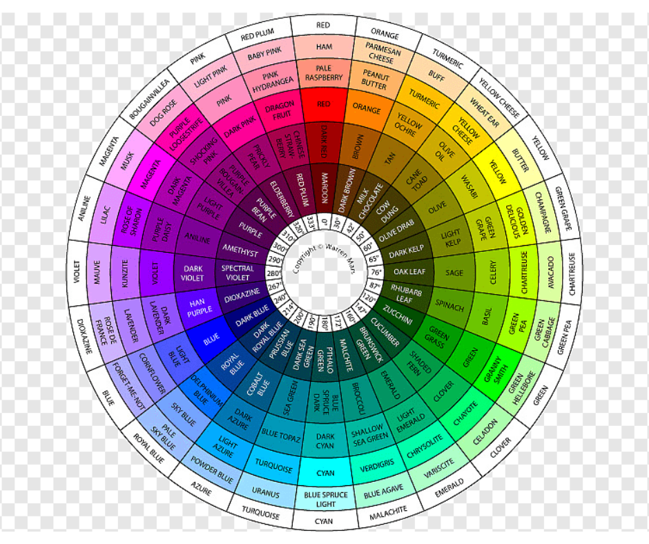
I like one like this that shows many subtleties and variations of different colors. Not that I really actually refer to a color wheel much, I just know that red is opposite green, blue is opposite yellow, and purple is opposite orange. And then there are the variations as you “fan out” from the primary colors.
The color wheel is a whole THING. And I’m not going to get into like secondary or tertiary, analogous, etc., color combinations today.
So, here’s why the blue chambray shirt worked with the print shirt underneath, even though none of the colors in the two items “match.” I’m going to say the brick in the shirt most closely matches maroon on this particular chart, and maroon is opposite (“contrasts with”) “blue spruce light,” which is very close to the blue of the chambray. The yellow in the print is in the yellow ocher/turmeric section, which is opposite pale sky blue, which is also very close to the shirt. We already know the maroon and the yellow ocher go well together because the designer combined them. So if the blue goes well with each of those colors, and they go well together, then the blue is going to go with the overall print.
This is all much clearer (and cleaner!) in my head! But it’s like if A=B and A=C, then A=B+C! Fashion Math for the win! Is this making sense….or am I just a lunatic? A lunatic who’s pretty good at combining colors…? Ha ha.
Let me know if this helped you at all. Let me know if you even made it this far!
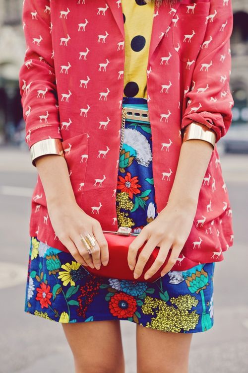
Don’t be afraid to try different color combinations. Do little things first. You don’t have to start out like THIS (although this is DARLING and really not as complicated as it may look):
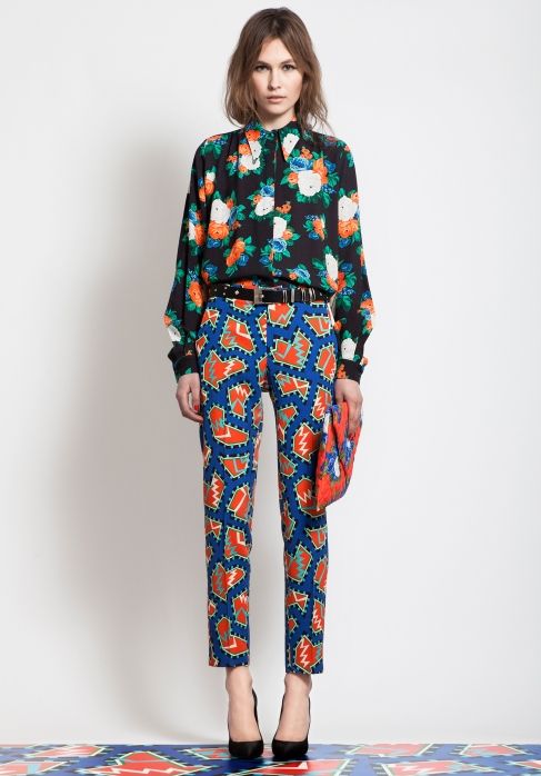
or this…
Try it with a printed scarf maybe, or a striped tee under a floral blouse. Something easy. It’s fun!
Fashion is Meant to Be Fun! You remember fun, don’tcha? You’re supposed to enjoy it!
Thanks for playing!

Amy
This is fun! Thanks!
bettyewp
Right?
julia
You did remind me that fashion should be fun. I’ve been so utilitarian lately that I’ve forgotten to have fun. Some of those print combinations are woooh-weee! That would disrupt an office somewhere! Have a glorious weekend!
bettyewp
DISRUPT ALL THE OFFICES!!! Haha, lookit me, Miss GreyBlackNavy 🙂
Christine
So informative!! Love all the colorful examples.
bettyewp
I actually had to rein myself in – there were SO many wonderful colorful examples! I’ll do a part two soon…
jodie filogomo
LOVE seeing these examples because color has such an impact on us!! I was surprised that you you liked all the brights because it seems like you’d been going through a neutral period lately.
XOOX
Jodie
http://www.jtouchofstyle.com
bettyewp
It’s so funny, where I use the word “color,” and I’m happy with that, you use the word “brights,” and I balk 🙂
I LIKE color. I REALLY like colorful patterns and combining things. But trying to find colorful patterns that I like THAT FIT MY BODY is a challenge. So I never have much to work with in my own wardrobe.
And I’m definitely more “colorful” in the warm weather. In the winter I definitely go to earth, literally, in greys and taupes and browns.
I think fall is my favorite “color season.” I love all the rich warm colors…more than summery pastels. On me.